Web Design Tips to Turn More Visitors Into Customers
A good-looking site is not the same thing as a high-performing site. That gap trips up a lot of small businesses. Owners invest in fresh colors, polished photos, and a modern layout, then wonder why traffic comes in but leads stay flat. The problem usually is not effort. It is that many websites are designed to impress, while very few are designed to persuade.
If your website is supposed to help you book consultations, sell products, fill service calendars, or generate quote requests, every design choice has to earn its place. The best web design does more than represent your brand. It removes doubt, guides attention, and makes the next step feel obvious.
I have seen simple sites outperform elaborate ones by a wide margin. Not because they were prettier, but because they were clearer. A visitor landed, understood what the business offered, trusted the company, and knew what to do next. That is the real job of web design.
For businesses competing locally, especially in crowded service categories, that job matters even more. Whether you are investing in general web design improvements or looking for website design for small business growth, the goal is the same: turn attention into action.
Start with the visitor's first question
When someone lands on your homepage, they are not asking whether the font pairing is sophisticated. They are asking three things, often in the first few seconds.
What do you do?
Is this for me? Can I trust you?If your design does not answer those questions fast, you lose people before your sales pitch starts.
This is where many websites go wrong. They open with vague hero copy like "Helping businesses reach their full potential" or "Quality solutions tailored to your needs." That language sounds polished but says almost nothing. A stronger homepage headline is specific and grounded in what the customer wants. A residential roofing company might say, "Roof repair and replacement in The Woodlands with fast inspections and clear pricing." A family law firm might say, "Practical legal guidance for custody, divorce, and mediation in Montgomery County."
Specificity reduces friction. It tells visitors they are in the right place. It also creates momentum, because people are far more likely to keep scrolling when they quickly recognize relevance.
A persuasive site does not make visitors interpret. It makes them feel understood.
Clarity beats cleverness almost every time
Clever design has a place. Memorable branding matters. But when cleverness gets in the way of comprehension, conversions suffer.
This shows up in a few common ways. Navigation labels become abstract. Buttons use playful wording that hides the action. Homepages lead with mood instead of meaning. Images look dramatic but fail to support the service being sold.
The fix is usually not dramatic. It is disciplined. Your navigation should be instantly familiar. Service pages should be named for the services people actually search for. Buttons should say things like "Request a Quote," "Schedule a Consultation," or "See Pricing." Your design can still have personality, but it should never force the user to decode your intent.
For website design for small business, this point matters even more because small businesses rarely have the luxury of endless traffic. If you only get a few hundred or a few thousand relevant visitors a month, every point of confusion costs real revenue.
I once reviewed a service website that had impressive animation and an expensive custom layout, yet its lead volume was weak. The issue was not hidden in analytics. It was visible in seconds. The homepage never clearly stated what the company did until halfway down the page, and the top-right button said "Let's Connect" instead of anything concrete. After simplifying the message and changing the primary call to action, lead submissions improved within weeks. No brand overhaul, just less ambiguity.
Design for scanning, because that is how people actually read
Most visitors do not read websites line by line. They scan. They jump from headline to subhead, glance at images, look for proof, and pause when something feels relevant. Your design needs to support that behavior rather than fight it.
That means visual hierarchy is not a decorative concern. It is a conversion tool.
Strong pages use clear heading levels, generous spacing, readable font sizes, and short blocks of copy where appropriate. They highlight the most important claims without crowding the screen. They use contrast intentionally so buttons stand out and key messages do not disappear into the background.
A page can have excellent information and still underperform if it feels dense, cluttered, or tiring. Visitors do not reward effort. They reward ease.
One practical benchmark is this: if someone scans your homepage for ten seconds, could they identify your offer, your service area, your credibility, and your next step? If not, the page likely needs simplification.
Your call to action should feel timely, not desperate
A lot of websites know they need calls to action, so they place one everywhere. The result is often noisy and ineffective. Every section says "Contact us now" with the same weight and urgency, regardless of where the visitor is in the decision process.
A better approach is to match the call to action to the visitor's level of readiness.
Someone at the top of the funnel may not be prepared to buy immediately. They may want to see pricing, examples of your work, or answers to common objections. Someone returning to your site from a branded search probably needs a faster path to contact. Design should accommodate both.
Primary calls to action should be visible early and repeated throughout the page, but repetition should feel natural. A law firm might place "Schedule a Consultation" near the top, then later include a section that addresses cost concerns and follow it with a softer prompt. A contractor might lead with "Request an Estimate" and later offer "View Recent Projects" for visitors who need more confidence before reaching out.
The strongest websites understand that conversion is not always a straight line. They offer the next right step, not just the final one.
Trust is a design element, not just a marketing concept
Trust rarely comes from one thing. It comes from accumulation. The visitor notices your site loads quickly, your branding feels consistent, your contact information is easy to find, your reviews look real, your team photos feel credible, and your service descriptions sound experienced rather than generic. Each detail contributes to a larger judgment: can I rely on this business?
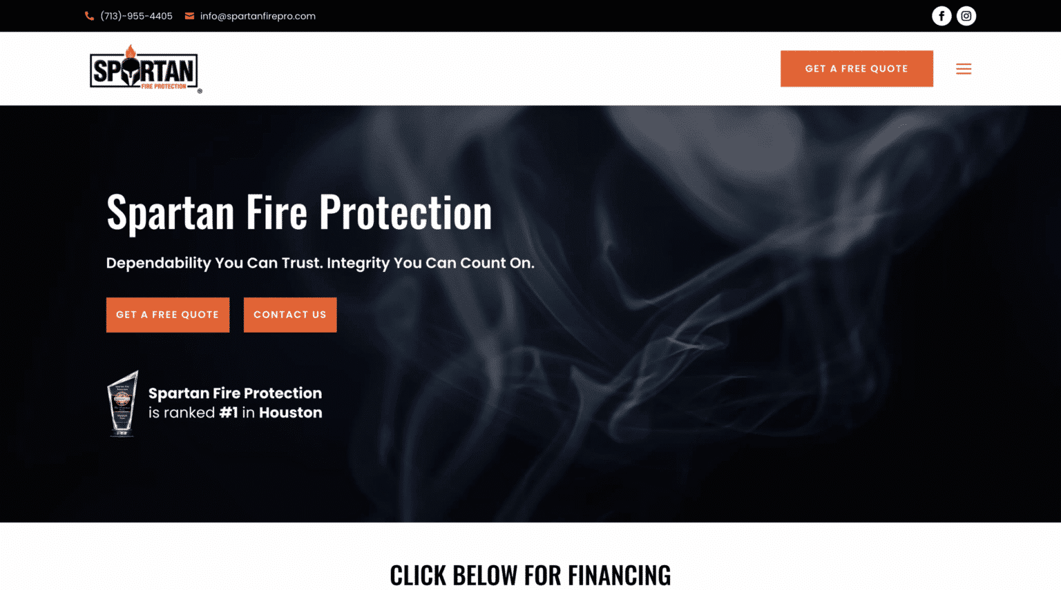
That judgment happens fast.
Trust signals should be woven into the design, not tucked away as an afterthought. Reviews near service descriptions often work better than a single testimonial page nobody visits. Before-and-after photos, certifications, years in business, local affiliations, guarantees, and clear process explanations all reduce uncertainty. For professional services, author pages, team bios, and original photography usually outperform anonymous stock images and vague claims.
This is especially true in local markets. If someone is searching for web design The Woodlands, for example, they are often looking for more than technical skill. They want confidence that the provider understands the local business environment, can communicate clearly, and will be available when needed. A site that shows local familiarity, relevant case studies, and direct contact options will usually create more trust than one that feels distant or interchangeable.
Trust also comes from restraint. Inflated promises can hurt more than help. Visitors have seen enough marketing to recognize exaggeration. "Guaranteed explosive growth" makes serious buyers skeptical. "We redesigned the site to reduce drop-off and increase lead form submissions" sounds measured and believable.
Mobile experience is no longer a secondary pass
Many businesses still treat mobile design as a condensed version of the desktop site. That mindset is expensive. For a large percentage of local traffic, mobile is the first and sometimes only experience a user has with your brand.
A mobile-first conversion experience looks different. It prioritizes speed, thumb-friendly buttons, short forms, click-to-call access, and content blocks that stack cleanly without becoming endless. It also avoids design choices that feel elegant on a large screen but frustrating on a phone, such as tiny text, side-by-side sections with cramped content, and menus that bury essential pages.
A mobile visitor is often closer to action than a desktop visitor. They might be standing outside a storefront, comparing service providers, or trying to solve a problem quickly. If your phone number is hard to tap, your form asks for too much, or your page takes too long to load, they leave.
I have watched businesses spend heavily on paid traffic while losing mobile leads because their quote form had nine fields and a clunky date picker that barely worked on iPhones. Cutting the form down to the essentials improved submissions without changing the offer at all. Design choices like that can matter more than an expensive redesign.
Speed shapes conversion more than many owners realize
Speed is one of those issues people know matters, but often underestimate. It is not just about search rankings. It changes how your business feels.
A slow website creates subtle doubt. Visitors may not articulate it, but delay suggests friction, and friction lowers confidence. If a page takes too long to appear, people assume the rest of the experience may be just as inconvenient.
Large image files, too many scripts, bloated themes, auto-playing media, and unnecessary animations are frequent culprits. The irony is that many of these features are added to make a site feel more premium, while in practice they make it feel heavier and less responsive.
Fast sites do not need to look bare. They need discipline. Optimized images, smart caching, efficient code, and selective use of effects often produce a better user experience than layering on one visual feature after another.
If you are deciding where to invest first, site speed improvements can produce a stronger return than cosmetic updates. Visitors reward responsiveness.
Your forms are part of your sales process
Lead forms often get treated like a technical necessity. In reality, they are one of the most sensitive points in the customer journey. This is where interest turns into commitment, even if that commitment is small.
Every field adds effort. Every unclear label adds hesitation. Every unnecessary requirement creates drop-off.
Ask only for what you need to move the conversation forward. For many service businesses, that means name, contact information, and a brief description of the project or issue. If you need more detail later, collect it later. The form should open the door, not recreate your intake process.
The design around the form matters too. A form should be visually simple, easy to complete on mobile, and surrounded by reassurance. Tell people what happens next. Will you respond within one business day? Will the estimate be free? Will their information remain private? Small context cues lower the mental cost of submitting.
Here is a short checklist I use when reviewing underperforming lead forms:
- Remove any field that is not essential for first contact.
- Place one clear promise near the form, such as response time or next step.
- Make the submit button specific, like "Request My Estimate" instead of "Submit."
- Test the full form on multiple phones, not just on a desktop preview.
- Add proof nearby, such as a testimonial, review rating, or service guarantee.
None of these changes are flashy, but they often lift results because they address where hesitation actually happens.
Good copy and good design are inseparable
There is a tendency to separate web design from messaging, as if one team handles visuals and another team handles words. On real websites, visitors experience both at once. Weak copy can drag down strong design, and messy design can bury strong copy.
Persuasive websites use words with purpose. Headlines make claims the audience cares about. Supporting text explains benefits without drifting into jargon. Captions, buttons, and section labels help visitors move confidently. Even microcopy, such as the note under a form field or the text next to a phone number, affects behavior.
One useful test is to strip away the styling and read the page as plain text. Does the message still persuade? Then put the styling back and ask whether the design strengthens the message or merely decorates it.
For small business sites, this alignment is often where the biggest gains live. A business may not need more pages. It may need sharper positioning and cleaner presentation. That is why website design for small business should never stop at aesthetics. It has to include message clarity, trust, and conversion logic.
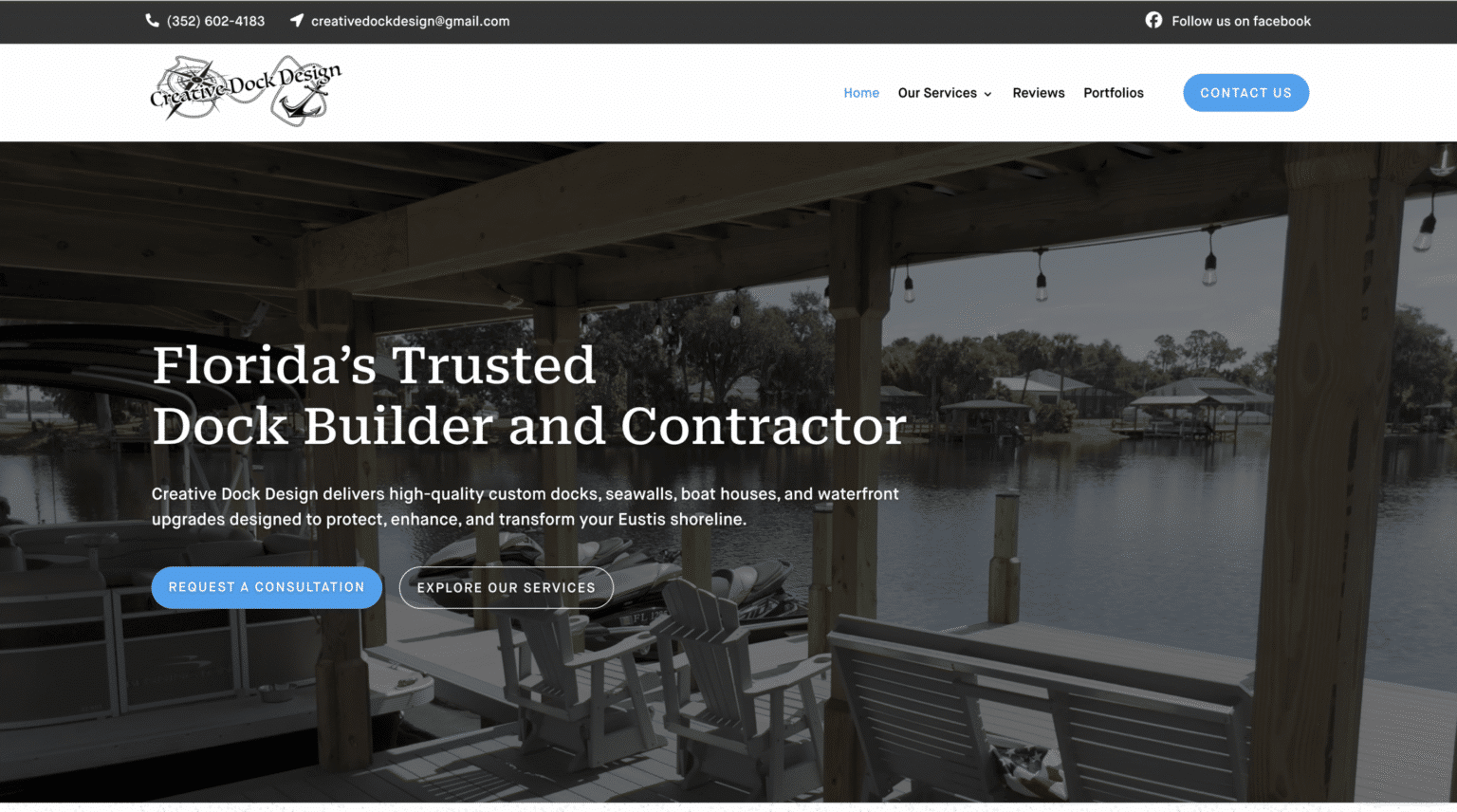
Show real proof, not just polished claims
Visitors are skeptical for good reason. They have seen too many websites make broad promises and offer little evidence. If you want more conversions, your site needs proof points that feel concrete.
Case studies are excellent because they combine context with results. A short project summary that explains the problem, the approach, and the outcome tends to be more persuasive than a page full of generic praise. Reviews also matter, but they carry more weight when they sound specific. "They helped us redesign our outdated site and quote requests increased within two months" is far stronger than "Great service, highly recommend."
Photos matter too. Real images of your team, office, products, or completed work nearly always outperform stock visuals in local service industries. They make your business easier to trust because they reduce the distance between the visitor and the company.
If you serve a defined geographic market, local proof can be especially powerful. Mention neighborhoods, industries, project types, or regional context where appropriate. For a company offering web design The Woodlands businesses can rely on, local examples help transform a broad service into a tangible one.
Navigation should reduce decisions, not create them
Too many websites try to put every page, offer, feature, and idea into the main menu. The result is cognitive overload. When visitors see too many options, they pause. Sometimes that pause ends in a bounce.
Strong navigation reflects what users care about most. Usually that means a small set of clear paths: services, about, results or portfolio, pricing if relevant, and contact. If your business has multiple audience types or complex offerings, architecture matters even more. Group related pages logically. Use descriptive labels. Avoid dropdown menus so large they feel like spreadsheets.
Your web design the woodlands homepage should also support navigation by acting as a guided summary, not a dumping ground. It should point people toward the service page, the proof section, the process, and the call to action in a sequence that makes sense.
Here are a few warning signs that your current design may be costing you customers:
- Visitors ask basic questions that your website should answer immediately.
- Traffic reaches your site, but contact form submissions stay low.
- Mobile users spend little time on key pages or abandon forms halfway through.
- Your homepage looks attractive, but the next step is not obvious.
- Important trust signals are buried instead of placed where decisions happen.
When these issues show up, the solution is usually strategic simplification rather than adding more content.
The best-performing pages respect buying psychology
People do not make decisions in a vacuum. They move through a sequence of emotions and evaluations: curiosity, recognition, skepticism, comparison, reassurance, then action. High-converting web design supports that sequence.
Curiosity gets them to stop. Recognition tells them this offer fits their need. Skepticism asks whether your claims are credible. Comparison forces them to weigh you against alternatives. Reassurance helps them feel safe choosing you. Action happens when the next step is clear and easy.
Most websites do one or two of these steps well and neglect the rest. A beautiful site may create curiosity but fail at reassurance. A detailed site may answer questions but never create momentum. A hard-selling site may push for action before trust is earned.
This is where experience matters. Conversion-focused web design is not about copying trends. It is about understanding human behavior and reducing the frictions that interrupt it.
Local businesses need local credibility
For local companies, persuasion is often practical before it is emotional. People want to know you serve their area, understand their needs, and can be reached without hassle. That may sound obvious, but many local sites bury this information or mention it only in footers.
Bring your local relevance into the main experience. Mention your service area in your homepage headline if it helps clarity. Build dedicated location pages when appropriate, but make them genuinely useful rather than thin copies of one another. Include local testimonials, recognizable landmarks where relevant, and a clear business address or service radius.
This principle applies just as much to agencies as it does to plumbers, dentists, or landscapers. If someone is looking for web design The Woodlands firms can deliver face-to-face or with regional insight, your website should make that value visible early. Local trust is not built by stuffing place names into copy. It is built by showing that you know the market and the people you serve.
Small improvements compound
Many owners think they need a total rebuild to get better results. Sometimes they do. More often, several targeted improvements create meaningful gains without tearing everything down.
A clearer headline can reduce bounce rate. Faster load speed can keep more visitors on the page. Better placement of reviews can increase trust. A shorter form can lift inquiries. More direct calls to action can convert buyers who were already interested but not sure where to click.
The compounding effect is what makes web design such a powerful business tool. You are not just polishing a digital brochure. You are improving the sales environment your prospects walk into every day.
That is why the best web design work starts with questions, not colors. What are visitors trying to do? Where do they get stuck? What objections keep them from reaching out? Which pages attract serious buyers, and which pages leak them away? When those answers shape the design, performance improves for the right reasons.
A website should not merely exist. It should clarify your value, strengthen trust, and move people toward action with as little friction as possible. When it does that well, more traffic becomes more conversations, more quotes, and more customers. That is the standard worth designing for.
Scalable Websites
Website design for contractors and small businesses
Based in Montgomery, TX, serving Montgomery County and greater Houston
Phone: (832) 979-2478
Website: scalablewebsites.com
Hours: Monday to Friday, 8 AM to 5 PM
Scalable Websites builds and manages mobile-first websites for contractors and small businesses on simple monthly plans, with hosting, security and unlimited updates included. Find us on Google.